



Images
- UI Components
- Images
Image thumbnails
In addition to our border-radius utilities, you can use .img-thumbnail to give an image a rounded 1px border appearance.
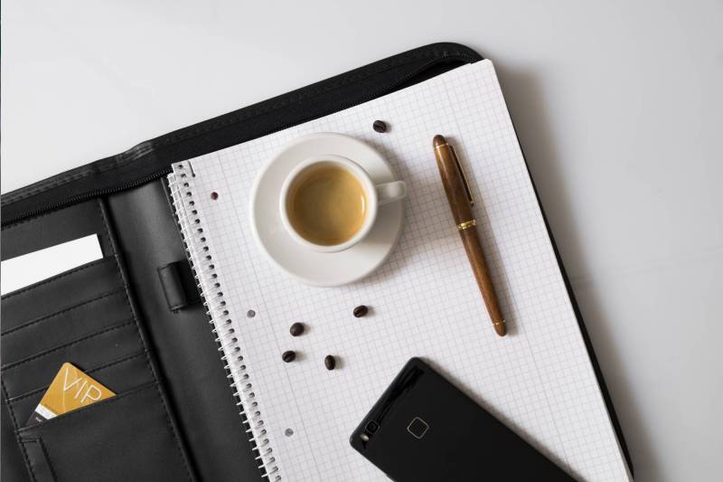
Image Rounded & Circle
Use classes .rounded and .rounded-circle.

.rounded 
.rounded-circle Responsive images
Images in Bootstrap are made responsive with .img-fluid. max-width: 100%; and height: auto; are applied to the image so that it scales with the parent element.

Images Sizes
Avatar Img

.avatar-xs
.avatar-sm
.avatar-md
.avatar-lg
.avatar-xl
Avatar With Text
Default media object
The default media displays a media object (images, video, audio) to the left or right of a content block.

Media heading
Cras sit amet nibh libero, in gravida nulla. Nulla vel metus scelerisque ante sollicitudin. Cras purus odio, vestibulum in vulputate at, tempus viverra turpis.
Media heading
Cras sit amet nibh libero, in gravida nulla. Nulla vel metus scelerisque ante sollicitudin. Cras purus odio, vestibulum in vulputate at. Media heading
Cras sit amet nibh libero, in gravida nulla. Nulla vel metus scelerisque ante sollicitudin cras purus odio in vulputate.Media object
Cras sit amet nibh libero, in gravida nulla. Nulla vel metus scelerisque ante sollicitudin. Cras purus odio ac nisi vulputate faucibus. Media alignment
The images or other media can be aligned top, middle, or bottom. The default is top aligned.
Top-aligned media
Cras sit amet nibh libero, in gravida nulla. Nulla vel metus scelerisque ante sollicitudin. Cras purus odio, vestibulum in vulputate at, tempus viverra turpis..
Donec sed odio dui. Nullam quis risus eget ornare vel eu.
Center-aligned media
Cras sit amet nibh libero, in gravida nulla. Nulla vel metus scelerisque ante sollicitudin. Cras purus odio, vestibulum in vulputate at, tempus viverra turpis..
Donec sed odio dui. Nullam quis risus eget ornare vel eu.

Bottom-aligned media
Cras sit amet nibh libero, in gravida nulla. Nulla vel metus scelerisque ante sollicitudin. Cras purus odio, vestibulum in vulputate at, tempus viverra turpis..
Donec sed odio dui. Nullam quis risus eget ornare vel eu.