
APIC – Bootstrap Admin Dashboard for SaaS & Analytics
APIC is a responsive, creative, and modular Bootstrap admin dashboard template, ideal for sales and analytics dashboards, management panels, and general SaaS-based admin interfaces.

See every module before you buy
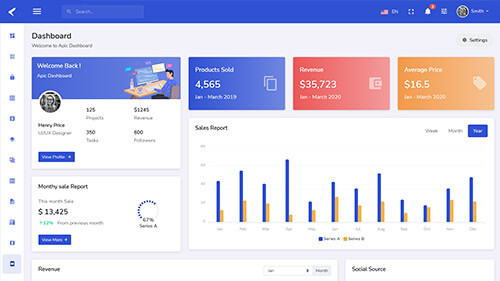
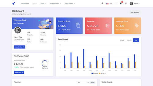
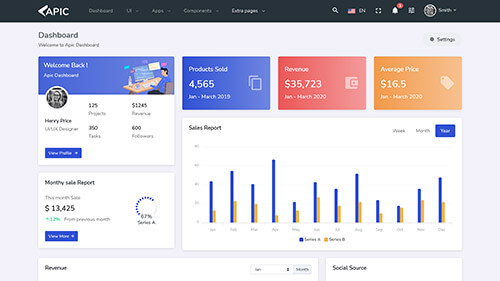
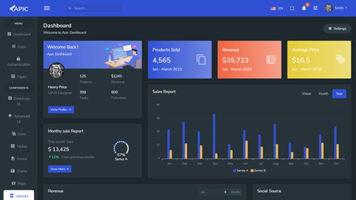
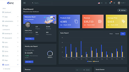
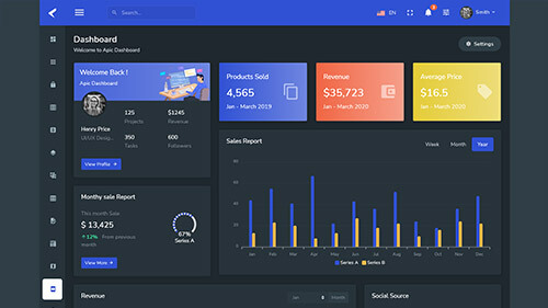
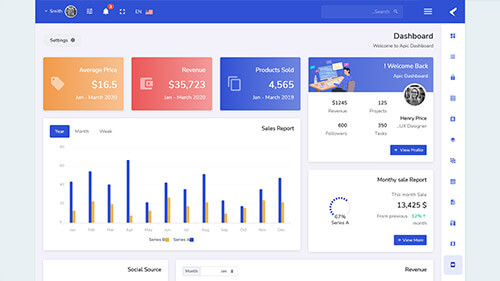
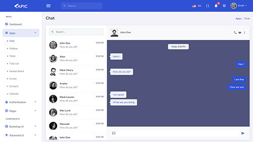
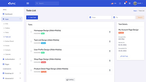
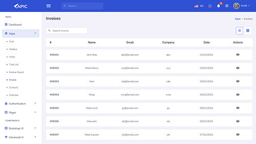
Each screenshot opens the full APIC – Bootstrap Admin Dashboard for SaaS & Analytics live preview, where you can browse the live preview and documentation.













Overview
About APIC
Analytics and sales dashboards live or die on how clearly they present numbers that decision-makers need to act on quickly, and a lot of admin templates get the balance wrong — either too plain to make data genuinely engaging, or too decorated to let the actual numbers stand out clearly. APIC – Bootstrap Admin Dashboard HTML Template aims for the middle: a responsive, creative, and modular Bootstrap admin dashboard panel built for sales and analytics dashboard use cases, management dashboard panels, and SaaS-based panel templates that need both visual polish and genuine data clarity.
APIC's modular structure means teams aren't locked into one rigid dashboard layout. Components can be rearranged, restyled, and recombined to fit a specific product's data and workflow needs, rather than forcing every project into an identical fixed structure regardless of what it's actually trying to present to its users. That flexibility matters directly for analytics-heavy products, where the right dashboard layout often depends heavily on the specific metrics and data relationships a business cares most about at any given stage of its growth.
The template is well suited for sales dashboards tracking pipeline and revenue metrics, analytics platforms presenting user or product data, general management panels for internal operations, and SaaS products needing a capable, creative admin backend to support their growing user base. APIC's creative visual approach gives these often data-dense interfaces a genuine sense of design quality rather than the purely utilitarian look many admin templates default to by convention.
Why Modular Design Matters for Analytics Dashboards
Sales and analytics dashboards rarely stay static once they're built. New metrics get added as a business evolves, existing charts get reorganized as priorities shift, and different teams within the same company often want different views of overlapping underlying data. A rigid, fixed-layout admin template makes all of this ongoing evolution harder than it needs to be, requiring structural rework every time a dashboard's requirements change even modestly.
APIC's modular component approach is built specifically to absorb this kind of ongoing change. Because sections, charts, and widgets are built as distinct, recombinable pieces rather than baked into a single fixed page structure, teams can add a new metric, reorganize a dashboard's layout, or build an entirely new view using existing components, all without the disruptive rework a less flexible template would require every time requirements shift.
There's a related cost-of-change argument worth making explicit. Every time a rigid dashboard template needs restructuring to accommodate a new business requirement, that restructuring work competes with time that could otherwise go toward actual product features or business analysis. A genuinely modular dashboard reduces that recurring tax on engineering time, since most incremental changes become a matter of recombining existing components rather than rebuilding page structure from scratch each time a stakeholder asks for a new view of the data.
Key Features of APIC
Responsive, Mobile-First Design
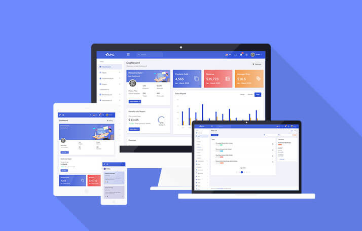
APIC adapts cleanly across desktops, tablets, and mobile devices, ensuring dashboards remain usable for administrators checking key metrics from any device, including on the go.
Creative, Modern Visual Design
APIC brings genuine design quality to dashboard interfaces, avoiding the purely utilitarian look that leaves many admin templates feeling like an afterthought rather than a considered product.
Modular Component Architecture
Charts, widgets, and page sections are built as distinct, recombinable components, supporting ongoing dashboard evolution without requiring structural rework each time.
Sales and Analytics Chart Support
Built-in chart components cover the visualization types sales and analytics dashboards commonly need, from revenue trends to conversion funnels and pipeline breakdowns.
Data Tables
Sortable, searchable data tables present larger datasets in a structured, navigable format, a near-universal requirement for management and analytics dashboards alike.
Form Components and Validation
A full set of form elements comes with validation logic already wired up, supporting the settings and data-entry screens most admin panels eventually need.
W3C Validated Code
The markup passes W3C validation, giving the template a clean, standards-compliant foundation that renders consistently across browsers.
Easy to Customize
The codebase is structured clearly, making it straightforward to adjust colors, components, and layout without wading through disorganized markup.
Dark and Light Theme Options
Both dark and light theme variants are available, giving teams flexibility in how the dashboard presents itself depending on brand preference or the visual conventions common in a specific industry.
Widget and Stat Card Library
A broad library of stat widgets and summary cards gives dashboards an at-a-glance overview layer, letting key metrics surface immediately without requiring a user to dig into deeper report views.
Detailed Documentation and 1 Year Support
Setup documentation and a year of dedicated support are included with every purchase, reducing friction during implementation and giving teams a reliable resource for troubleshooting.
Who Should Use APIC
APIC is a strong fit for sales teams building internal dashboards to track pipeline, revenue, and performance metrics, where clear data presentation directly influences daily decision-making. A sales leadership team reviewing pipeline health every morning needs a dashboard that surfaces the right numbers instantly, without requiring extra clicks or mental translation, and APIC's modular chart and widget components are built to support exactly that kind of fast, glanceable presentation.
Analytics platforms presenting user behavior, product usage, or business intelligence data benefit from APIC's chart-forward, modular structure, which adapts well to the specific metrics any given analytics product actually cares about. Every analytics product ends up caring about a slightly different set of core metrics, and a template that assumes one fixed dashboard shape rarely fits every product's actual reporting needs without significant customization; APIC's modularity removes much of that friction from the start.
SaaS companies building their product's own admin or analytics backend can use APIC as a foundation that balances genuine visual quality with the flexibility to evolve alongside the product. As a SaaS product matures and its own analytics and reporting needs grow more sophisticated, a dashboard built on rigid, fixed components tends to become a bottleneck; APIC's modular approach is built specifically to avoid that bottleneck by making structural evolution a normal, expected part of the dashboard's lifecycle rather than a disruptive exception.
And general operations or management teams needing an internal dashboard for tracking business metrics across departments can rely on APIC's modular components to assemble a view tailored to their specific reporting needs rather than working around a rigid, one-size-fits-all layout that was never quite designed with their particular department's metrics in mind. A finance team's dashboard needs look meaningfully different from an operations team's, even within the same company, and APIC's flexibility supports both from the same underlying component library.
Adapting APIC to Different Data Stories
What makes APIC genuinely useful across such different use cases is that it doesn't assume a single "correct" dashboard layout the way many templates implicitly do. A sales dashboard telling a pipeline story needs different visual emphasis than an analytics dashboard telling a user engagement story, and APIC's modular components let each of these different data narratives get the specific chart types, table structures, and layout emphasis they actually need, rather than forcing every use case through the same generic dashboard template built around a single assumed set of priorities.
This adaptability also matters for teams that don't yet know exactly what their final dashboard will look like. Early in a product's life, requirements are often still being discovered through actual usage, and a rigid template forces premature decisions about dashboard structure before those requirements are fully understood. APIC's flexibility supports iterating on dashboard structure as understanding improves, rather than locking a team into decisions made before the real data patterns were even clear, which reduces the risk of a costly structural rebuild once actual usage reveals what the dashboard should have prioritized from the beginning.
Building Dashboards That Grow With the Business
One of the more common failure patterns with admin dashboards is building for the metrics a business cares about at launch, only to find those metrics shift substantially within the first year as the product and its customer base mature. A startup tracking simple signup counts in month one might need cohort retention curves, revenue segmentation, and multi-touch attribution views by month twelve, and a rigid dashboard template forces a disruptive rebuild to accommodate that growth in sophistication. APIC's modular structure is built specifically to absorb this kind of maturation gracefully, letting new chart types and data views get added as components rather than requiring the underlying page architecture to be rebuilt from scratch each time the business's reporting needs grow more complex.
This matters just as much for teams supporting multiple internal stakeholders with different reporting needs. A single company's finance team, sales team, and product team often want meaningfully different views into overlapping underlying data, and building three separate custom dashboards from scratch is rarely a good use of engineering time. APIC's shared component library lets each team's dashboard draw from the same underlying building blocks while still presenting a view tailored to that specific team's priorities, avoiding both the cost of full custom builds and the frustration of forcing every team into an identical, poorly-fitting generic view.
Conclusion
APIC brings a genuinely flexible, design-forward option to Bootstrap admin theming: modular, recombinable components, strong chart and data table support, and a creative visual approach that treats dashboard design as more than an afterthought. For sales teams, analytics platforms, and SaaS products that need their admin dashboard to evolve alongside changing business requirements, APIC offers a foundation built specifically for that kind of ongoing flexibility rather than a fixed, one-time structure.
That flexibility becomes more valuable the longer a dashboard stays in active use. A template optimized purely for a strong initial launch impression tends to show its limitations within the first few months, once real usage reveals gaps between what the template assumed and what the business actually needs to track. APIC's modular foundation is built to absorb that gap gracefully, treating ongoing dashboard evolution as the normal course of a product's life rather than an unplanned deviation from the original design.
Related templates
The modules, laid out like the product itself
All 8 highlights, grouped the way they appear in APIC – Bootstrap Admin Dashboard for SaaS & Analytics's own sidebar.
Responsive, Mobile-First Design
Creative, Modern Visual Design
Modular Component Architecture
Sales and Analytics Chart Support
Data Tables
Form Components and Validation
W3C Validated Code
Easy to Customize
What buyers are saying
The template was carefully written such that it is simple to use and is quite easy as an admin panel.
Before you get started
APIC is a responsive, modular Bootstrap admin dashboard template built for sales and analytics dashboards, management panels, and SaaS admin backends.
APIC uses a modular component architecture, letting charts, widgets, and sections be rearranged and recombined without structural rework as requirements change.
Yes, APIC includes built-in chart support for sales metrics like revenue trends, conversion funnels, and pipeline breakdowns.
Yes, APIC is fully responsive and tested across modern browsers and mobile devices.
Yes, APIC is also available as an Angular 13 admin dashboard template for teams working in Angular.
APIC – Bootstrap Admin Dashboard for SaaS & Analytics in other frameworks
Related templates

Letstart – Minimal Bootstrap 5 Admin Dashboard Template
Letstart is a minimal, modern Bootstrap 5.3 admin dashboard template with 70+ pages and 100+ components, built with Sass and jQuery for eCommerce panels and HTML back-end dashboards.

Marvel – Bootstrap Admin Dashboard Template for SaaS & CRM
Marvel is a Bootstrap 5.3 admin dashboard template with 135+ pages, 350+ components, and prebuilt Kanban, invoice, and eCommerce UI, built for SaaS, CRM, and analytics platforms alike.
Adminox – Angular 22 Admin Dashboard with 70+ Components
Adminox is a modern Angular 22 admin dashboard starter with 40+ pages, 6 layouts, 3 chart libraries, JWT auth, and NgRx Signals, ready for SaaS, CRM, and analytics projects from day one.
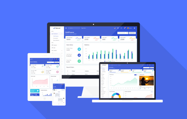
Marvel – Angular Admin Dashboard Template for SaaS & CRM
Marvel is an Angular 21 admin dashboard template with 120+ pages, 350+ components, and prebuilt Kanban, invoice, and eCommerce UI, built for SaaS, CRM, and analytics platforms alike.
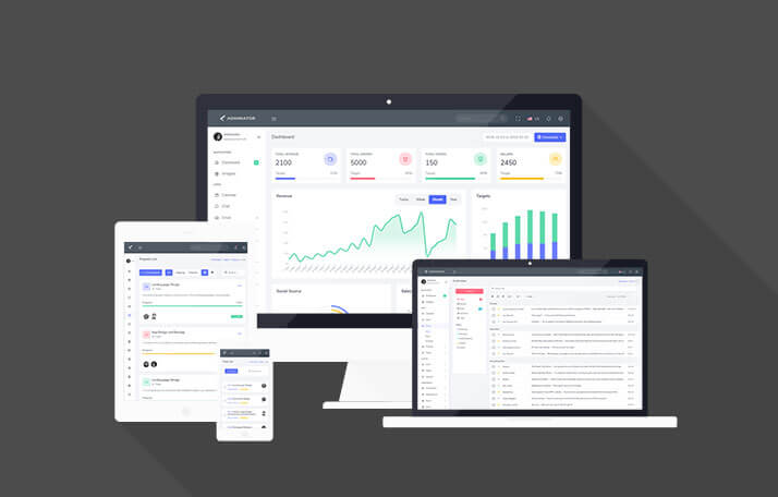
Adminator – Bootstrap 5 Admin Dashboard & Panel Template
Adminator is a clean, modern Bootstrap 5 admin dashboard template built with SCSS and jQuery, ideal for eCommerce panels, analytics dashboards, and project management admin panels.

Proctu – Hospital & Medical Bootstrap Admin Template
Proctu is a Bootstrap framework-based admin dashboard panel built for patient and hospital dashboards, doctor medical admin panels, and general healthcare HTML dashboard applications.
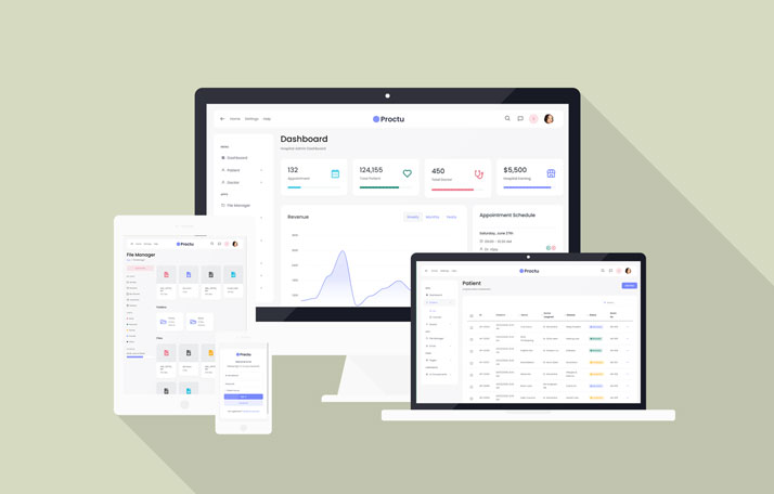
Proctu – Hospital & Medical React Next.js Admin Template
Proctu is a React Next.js framework-based admin dashboard built for patient and hospital dashboards, doctor medical admin panels, and general healthcare React dashboard applications.
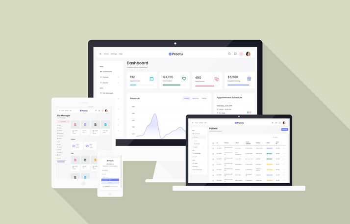
Proctu – Hospital & Medical Angular Admin Template
Proctu is a Bootstrap and Angular 22 admin dashboard panel built for patient and hospital dashboards, doctor medical admin panels, and general healthcare Angular applications today.
Use code FIRST30 at checkout — valid across every Bootstrap, Angular, and React
template.