
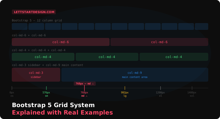
The md breakpoint — tablets and small laptops — is where most Bootstrap layouts need the most attention. Layouts that look great on desktop and mobile can feel cramped or awkward on medium-sized screens. We spend extra time testing and adjusting at that breakpoint specifically. It's also where I most often see mistakes in templates built by other developers — designed for two extremes, neglected in the middle.
From building templates: The Bootstrap 5 grid system is one of the most well-documented features in frontend development. And yet it's one of the most commonly misused. Not because it's complicated — it's not. Because most developers learn the desktop and mobile cases and assume the middle takes care of itself. It doesn't.
This guide covers how the Bootstrap 5 grid actually works, with real layout examples from admin dashboard development — including the specific breakpoint issues that cause layouts to break in production.
The md breakpoint is where I spend disproportionate time when building and reviewing templates. It's the breakpoint most users encounter — tablets, laptop browsers not maximized, split-screen windows. Getting it right isn't glamorous work but it's the difference between a template that feels polished and one that feels like it was only tested on a phone and a wide monitor.
How the Bootstrap 5 Grid Works
Bootstrap 5 uses a 12-column flexbox grid. Every layout is built by dividing those 12 columns across a row. A column spanning 6 of those 12 takes up half the width. A column spanning 4 takes up a third. The math is always out of 12.
Three components make up every grid layout: a container that sets the max width and horizontal padding, a row that creates the horizontal grouping and manages negative margins, and columns that define width using the col-{breakpoint}-{size} class pattern.
<div class="container">
  <div class="row">
    <div class="col-md-6">Left half</div>
    <div class="col-md-6">Right half</div>
  </div>
</div>
The md prefix means this column behavior applies at the md breakpoint and wider. Below md, both columns stack to full width automatically — no extra classes needed for the mobile case.
Container Types — Which One to Use
Bootstrap 5 gives you three container options and picking the right one matters more than most developers realise. .container sets a fixed max-width at each breakpoint — the right choice for most landing pages and marketing sites where you want controlled line lengths. .container-fluid spans the full viewport width at every breakpoint — better for admin dashboards where you want to use every pixel of available screen space. .container-{breakpoint} is fluid below the specified breakpoint and fixed above it — useful for hybrid layouts that need to breathe on mobile but stay contained on desktop. For admin dashboard templates specifically, .container-fluid combined with consistent internal padding is almost always the right call.
The 6 Breakpoints and What They Mean
| Breakpoint | Class Prefix | Min Width | Typical Device |
|---|---|---|---|
| Extra small | col- | 0px | Portrait phones |
| Small | col-sm- | 576px | Large phones, landscape |
| Medium | col-md- | 768px | Tablets, small laptops |
| Large | col-lg- | 992px | Laptops, desktops |
| Extra large | col-xl- | 1200px | Large desktops |
| Extra extra large | col-xxl- | 1400px | Wide monitors |
Bootstrap works mobile-first. This means column classes apply at their breakpoint and above. A col-md-6 is 50% wide from 768px upward, and 100% wide below that. You stack classes to handle different behaviors at different breakpoints.
Real Layout Examples
Two Equal Columns
<div class="row">
  <div class="col-md-6">Left column</div>
  <div class="col-md-6">Right column</div>
</div>
Three Equal Columns
<div class="row">
  <div class="col-md-4">First</div>
  <div class="col-md-4">Second</div>
  <div class="col-md-4">Third</div>
</div>
Four Stat Cards (Dashboard Pattern)
<div class="row g-4">
  <div class="col-sm-6 col-xl-3">Revenue card</div>
  <div class="col-sm-6 col-xl-3">Users card</div>
  <div class="col-sm-6 col-xl-3">Orders card</div>
  <div class="col-sm-6 col-xl-3">Growth card</div>
</div>
The g-4 class adds gutters (gap) between cards. This pattern — 2-up on tablet, 4-up on desktop — is one of the most common in admin dashboards and avoids the cramped 4-up tablet layout that looks poor at 768px.
Bootstrap 5 also gives you directional gutter control — gx-4 for horizontal gutters only and gy-4 for vertical gutters only. In a card grid where cards stack on mobile, using gy-3 gx-4 gives you tighter vertical spacing between stacked cards on mobile while keeping the horizontal gap consistent on wider screens. It's a small detail that improves mobile layout quality significantly without any additional media queries.
Grid in Admin Dashboard Layouts
Sidebar + Main Content (Classic Admin Layout)
<div class="row">
  <div class="col-md-3 col-lg-2">
    <!-- Sidebar navigation -->
  </div>
  <div class="col-md-9 col-lg-10">
    <!-- Main content area -->
  </div>
</div>
Notice the sidebar uses col-md-3 col-lg-2 — slightly narrower on large screens to give more space to the content area. This kind of breakpoint-specific refinement is what separates a polished admin layout from a basic one.
Chart + Table Layout
<div class="row g-4">
  <div class="col-12 col-xl-8">
    <!-- Main chart - full width on tablet, 2/3 on desktop -->
  </div>
  <div class="col-12 col-xl-4">
    <!-- Sidebar stats - full width on tablet, 1/3 on desktop -->
  </div>
</div>
Using col-12 at the tablet breakpoint lets charts expand to full width where they need the space, then switch to a side-by-side layout on larger screens. This is better than forcing a cramped two-column layout at 768px where chart readability suffers.
The md Breakpoint Problem
This is the most common grid mistake in Bootstrap templates, and it's one we specifically test for in every template we ship on LettStartDesign.
The pattern looks like this: a developer designs a beautiful four-column stat card row for desktop and makes sure it stacks to single column on mobile. At 768px — iPad, small laptop, Windows tablet — those four columns squeeze together and become unreadable. The font is too small, the padding is compressed, and the content overflows.
md breakpoint (768px–991px).The fix is intentional column behavior at md. For four stat cards, instead of letting them squeeze to four columns at 768px, force them to two columns at that breakpoint:
<!-- Wrong — all four squeeze at md breakpoint -->
<div class="col-md-3">Card</div>

<!-- Correct — 2-up at tablet, 4-up at desktop -->
<div class="col-sm-6 col-xl-3">Card</div>
The col-sm-6 col-xl-3 pattern gives you two cards per row from 576px to 1199px, then four cards per row from 1200px upward. The tablet experience is intentional and readable, not an afterthought.
Common Grid Mistakes to Avoid
- Missing row wrapper — Columns must always be direct children of a row. Nesting columns inside other columns without a row wrapper between them breaks the gutter calculation.
-
Columns not adding up to 12 — If you have
col-md-5andcol-md-6in a row they won't fill the full width. Always verify your columns sum to 12 across each row. - Using px widths inside Bootstrap columns — Fixed pixel widths inside grid columns break responsiveness. Use percentage-based sizing or Bootstrap utility classes inside grid columns.
-
Forgetting gutters — Bootstrap 5 uses the
g-{size}class on the row for gutters. Without it, columns sit flush against each other.g-3org-4is appropriate for most admin dashboard layouts. -
Skipping the md breakpoint test — Resize your browser to exactly 768px and check every page. If anything looks broken or cramped, add explicit
col-md-classes to control that breakpoint directly. -
Nesting rows without resetting the column count — When you nest a row inside a column, the nested row still uses a 12-column grid relative to its parent column width — not the full page width. A
col-4inside acol-md-6parent takes up 4 of 12 columns of that half-width container, not 4 of 12 of the full page. This catches developers off guard when building complex dashboard widget layouts. -
Mixing Bootstrap grid with CSS Grid or Flexbox carelessly — Bootstrap 5 columns are flexbox-based internally. Adding custom
display: flexor CSS Grid rules on a.rowor.colelement directly interferes with Bootstrap's internal layout logic. Apply custom flex or grid rules to elements inside the column, never to the.col-*elements themselves.
Final Thoughts
The Bootstrap 5 grid is genuinely intuitive once you internalize the mobile-first logic — classes apply at their breakpoint and above, and you stack classes to handle different behaviors at different widths. The 12-column system is predictable, well-documented, and flexible enough to handle any admin dashboard layout you need to build.
The one thing worth repeating: test at 768px. It's the breakpoint that gets skipped most and causes the most visible layout issues in production. Add that resize check to your workflow as a standard step before deploying any page.
If you want to see these grid patterns working in a production-quality admin template, our Marvel Free dashboard uses them throughout — and the Marvel Angular premium has seven layout variants each implementing different grid approaches for different use cases.
See the Grid in Action
Marvel Free uses Bootstrap 5 grid patterns throughout — download it and explore the code.
Download Marvel Free →